Callout Assets
This section presents callout assets, including methods, properties, and events.
To learn about creating callouts and adding callout controls, see Callouts.
A rich set of methods, properties, and events are automatically created for each callout and for selected callout controls. They are displayed under the callout in the Assets Panel.
-
When a button control is added to a callout, a property Value is created automatically for the text displayed on that button.

That text can then be modified dynamically using actions to modify the contents of the Value property.

-
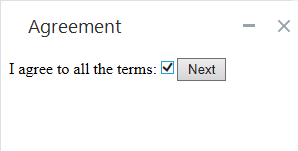
When a checkbox control is added to a callout, a property Checked is created automatically to represent the checked/cleared status of the checkbox.

The status of the checkbox can then be read or modified dynamically by reading from or writing to the Checked property.
Callout Methods
Allows you to add JavaScript into the HTML body of the callout during run-time.
Parameters
|
Parameter |
Input Type |
Description |
|---|---|---|
|
JavaScript |
Text | The JavaScript to inject |
Returns
(None)
Example
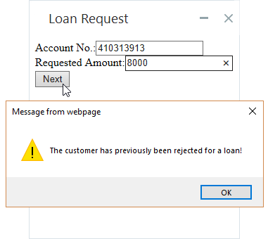
In this example, JavaScript will be injected into a callout when a customer who was previously rejected for a loan requests a loan again.
A text variable ShowWarning is created and its initial value is set to:
alert('Warning: The customer has previously been rejected for a loan!');
The text above is JavaScript that opens another pop-up with the text displayed.
The method below injects the JavaScript into a callout:

When the method above is executed, the JavaScript is injected and executed. The JavaScript causes the pop-up to display.
Specifies the HTML of the body of the callout. If this method is used while the callout is displayed, the body of the callout is immediately updated.
Parameters
|
Parameter Type |
Input Type |
Description |
|---|---|---|
|
Text |
Text | HTML of the content to display within the callout. |
Returns
(None)
Example
A simple variable with type Text called HTML1 was created and its initial value was set to:
<!DOCTYPE html><html><head><body><h1>Greeting Script</h1><p>Good morning, how can I help you today?</p></body></html>
This example sets the body of the callout and then displays the callout.
![]()
When run, the callout displays as below:
![]()
Callout Properties
Callout Events
Callout Control Properties
Callout control properties are described below. Note that not all are available for all control types. The table below indicates which properties are available for each control type.
|
Control |
|||||||||
|---|---|---|---|---|---|---|---|---|---|
|
1 Column |
|||||||||
| 2 Column | |||||||||
| Button | Y | Y | Y | ||||||
| Checkbox | Y | Y | Y | ||||||
| Image | Y | Y | |||||||
| Input | Y | Y | Y | ||||||
| Text Area | Y | ||||||||
| Label | Y | Y | Y | ||||||
| Link | |||||||||
| Map | |||||||||
| Radio Group | Y | Y | Y | ||||||
| Radio Group Option | Y | Y | |||||||
| Select | Y | Y | Y | Y | |||||
| Paragraph | |||||||||
| Tooltip |
Represents the checked/unchecked state of a checkbox control. When set to True, the checkbox is checked.
Note: A change made to this property will affect a checkbox that is currently displayed.
|
Type |
Read |
Write |
|---|---|---|
|
Boolean |
Yes | Yes |
Example
See the example provided for Visible, above.
Represents the enabled/disabled state of the control. When set to True, the agent cannot interact with the control.
Note: A change made to this property will affect a callout control that is currently displayed.
|
Type |
Read |
Write |
|---|---|---|
|
Boolean |
Yes | Yes |
Example
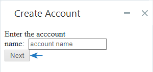
In the example below, the button is disabled before the callout is shown.

The callout is displayed as below. Note that the button is disabled and cannot be clicked.
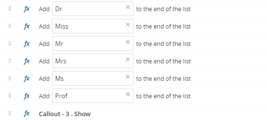
Lists the items in a select control. The methods and properties available are the same as for all lists. See List Variables.
Example
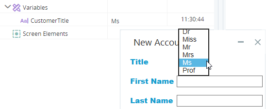
In the example below, a number of items are added to the list of items to list in a select control.
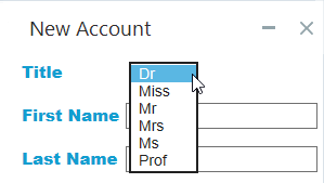
When the callout is displayed and the select control is opened, these items are listed:
Represents the index number of the option selected. The index number is 1-based.
|
Type |
Read |
Write |
|---|---|---|
|
Number |
Yes | Yes |
Example
In the example below, the index number of the option selected in a radio group control is written to the variable DayOfMonthOption.
![]()
During debug, if a different item is selected, the value of DayOfMonthOptionis updated. In this example, the second option is selected so DayOfMonthOption is set to 2.
![]()
Represents the text displayed next to one radio button in a radio group.
Note: A change made to this property will affect a callout control that is currently displayed.
|
Type |
Read |
Write |
|---|---|---|
|
Text |
Yes | Yes |
Example
In the example below, the text label for a radio button is set to 25th of Month.
![]()
The callout is displayed as below. The text label of the 3rd option is set to 25th of Month.
![]()
Represents the text shown in the control, as below:
Note: A change made to this property will affect a callout control that is currently displayed.
|
Type |
Read |
Write |
|---|---|---|
|
Text |
Yes | Yes |
Example
In the example below, the text of a label is set to the account's balance.
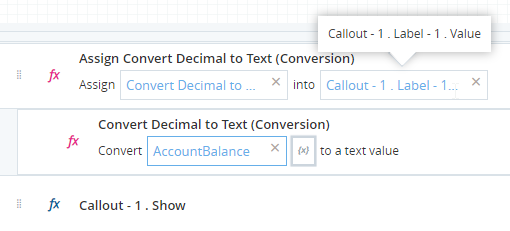
The value of the variable is displayed as text in the callout.

Represents the visible/invisible state of the control. When set to True, the control is visible.
Note: A change made to this property will affect a callout control that is currently displayed.
|
Type |
Read |
Write |
|---|---|---|
|
Boolean |
Yes | Yes |
Example
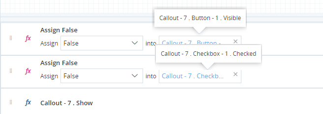
In the example below, the callout is displayed with its button hidden and its checkbox cleared.
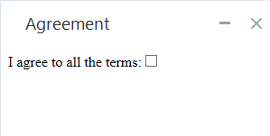
The callout is initially displayed as below:
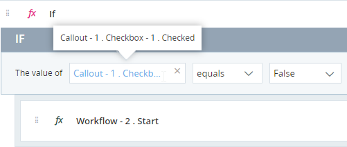
The event handler below makes the button visible when the checkbox is selected.
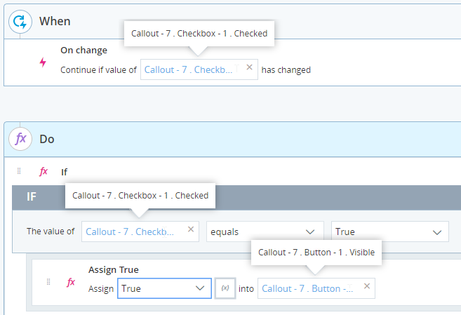
When the agent selects the checkbox, the button is made visible.
